Showing posts with label jpeg. Show all posts

Quick Tip: Straighten Up!

One of the easiest photo flaws to fix is a tilted picture. A horizon that's not quite horizontal or a vertical line that's not quite vertical can distract the eye away from the subject of a photo. So fix it!

Yikes. (Intentionally tilted in software for purposes of illustration.)

Most image editing programs will have at least a rotate function. You can use this to eyeball a correction. Or--my favourite--if your editing software allows, you can simply find a line in the photo that should be horizontal or vertical and, using the appropriate tool, drag your mouse along this line. The software will then do the rotating for you. Here's how to do it in my favourite software, darktable:

Open your image. In the right hand panel, click over to the basic group (the circle button), and then find the crop and rotate function. Select this function. Place your cursor at one end of a line that should be either horizontal or vertical. Right-click and hold, then (while still holding the right-click button) drag your cursor along the line to the other end. Release the button. darktable should automatically rotate the image for you.

If you're having trouble getting it just right, you can try zooming in to 100% or 200%. I find this often affords a more accurate correction. In this example, I'm using the shore as a guide, zoomed in to 100%:

Straightening a horizon in darktable. Click to enlarge.

Don't let your photos suffer from crooked horizons or diagonal verticals! Your viewers will thank you.

Behold! A (more or less) straight horizon!
18mm (~28mm equiv); 1/250 @ f/5.0, ISO 100


Photo Editing Techniques: Levels

Today I'm going to talk about a simple but powerful way to change the appearance of your photos: the levels tool. This post may look long, but that's because there are a lot of images--don't be intimidated! This is fairly easy stuff that can make a huge difference in your images.

The levels tool can be found in most image editing programmes (including my favourites, darktable and GIMP) but for the purposes of demonstration, I'll stick to using darktable only. I will also be using a simple image containing various tones to demonstrate the effects of levels adjustments. I encourage you to download this image and play with it on your own; the easiest way to learn is through hands-on practice:

Right click and save as to download to your own computer.


 The basic anatomy of the levels tool is a box containing the histogram for your image, with a black-to-white gradient at the bottom and a set of three sliders. The levels tool in your software of choice may look slightly different, but it should function similarly. In darktable (and in many other editors), you will also see three eyedroppers; these allow you to move the position of the sliders more precisely (more on that soon).

If you're familiar with your luminosity histogram, the levels tool will probably be reasonably intuitive. The gradient at the bottom represents the distribution of tones in your image--it's sort of a guide to reading your histogram. On the left, you have your darkest tones, in the middle you have your midtones, and on the right, you have your lightest tones.

Adjusting levels in darktable. Click on the image to see full-sized Note that the histogram at the top of this screen capture and the histogram in the levels tool are the same, and represent the distribution of tones in sample image shown at the beginning of this post.

The sliders are used to tell your image processor which tones in the original image should be rendered as pure black, which tones should be rendered as pure white, and where your middle grey should be positioned. Their default positions, therefore, will be at the far left, the far right, and the middle of the histogram respectively.

If you slide your black point slider to the right, the amount of black in the image will increase--anything that was darker in the original image than the new position of your slider will be rendered as pure black. Note that the middle slider will automatically be repositioned in the exact centre between the new black point and the white point. Note also that the histogram for your image (at the top right of the screen) will also change to reflect the new tonal distribution:

Changing the black point (and with it, the mid-point).

 Likewise, if you move your white point slider to the left, all of the tones in the original image that are lighter than its new location will be rendered as pure white. Again, the midpoint slider will automatically reposition itself to the centre between the black and white points:

Moving the white point.

Moving the middle grey slider is a little trickier to explain, but basically, the slider determines which original tone will now be rendered as middle grey. Therefore, if you move the slider to the left, your overall image will lighten (although your black point and white point will not be altered unless you choose to move them), because you are telling your editor that a tone originally closer to black should be lightened to midgrey, and therefore the other tones will also lighten to reflect the new distribution of tones. If you move the midpoint slider to the right, the overall image will darken, as you are telling your editor that it should darken what was originally a lighter tone into middle grey. This is easiest to understand by playing around with the sliders yourself.

Lightening the image by shifting the midpoint.

If you want to precisely place the black point, white point, or midpoint, you can use the eyedroppers. Simply click on the eyedropper associated with the point you wish to change, then click on the area of the image that you wish to place at that point.

So how does this work in colour? Let's play around with two examples. First, a colour distribution:

I encourage you to also download this image for practice.


Let's try moving the black point...

Shifting the black point.

...and now the white point...

Shifting the white point.

...and now the midpoint...

Shifting the midpoint.

...and now all three points:

Shifting black point, midpoint, and white point.

See how the levels tool can dramatically alter the look of your image?

Finally, let's play with a real-world example:

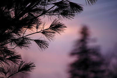
A Nova Scotian sunset.

See what happens if we shift the black point?

Moving the black point.

What about if we shift the white point?

Moving the white point.

And finally, what if we move the midpoint?

Moving the midpoint.

The levels tool is just that simple. And, to make life even better (at least in darktable), adjusting your levels will adjust your image in real time, letting you tweak it exactly to your liking. It's an easy tool that makes a powerful difference.

What the Heck is Raw, and Should I Use It?

If you spend much time exposed to photography talk, you'll soon start to hear the term "raw" bandied about (and you'll probably hear some strong opinions about how shooting raw is the best thing since sliced bread--or perhaps since plied yarn--or, alternatively, how it's a big waste of time and hard drive space). But what is raw?

A raw file, unlike a JPEG, is not an image. Rather, a raw file contains the information necessary to create an image. The information it contains was obtained at the time the particular photograph was made. Raw is often referred to as a digital negative since it is not usable without processing. The great advantage of a raw file is that it contains all of the information collected by the sensor when the photograph was taken. A JPEG, on the other hand, has compressed and discarded a significant portion of this data. This makes the raw file much more flexible than its processed counterpart. Raw files are also edited non-destructively, which means that you can do pretty much whatever you want to them without causing a decrease in the file quality (and you can't accidentally do something awful to your image and then save over the original, forever ruining it!). Basically, when you edit a raw file, you're just telling it how to display (and eventually create) the image it holds information about, without actually altering the file data. JPEGs, on the other hand, tend to degrade whenever you edit them, and because they have less information to begin with, you are more limited in the edits you can make.

Developing a raw file using darktable for Windows

More data, more flexibility, and non-destructive editing--sounds great, right? Unfortunately, there are a few disadvantages to shooting raw. First, raw files are significantly larger than JPEG files, so they will take up more space on your memory card (in camera) and your computer (after transfer) than the corresponding JPEG. Second, raw files require processing with specialised software. Processing will require additional time in your workflow (although once you are familiar with your raw processor, it can be quite fast), and many raw processors have a significant learning curve. If you don't get to know your raw processor well, your images may not look as good after processing as they would have if you'd just let your camera do all the work in the first place. Third, if you want to shoot many images in quick succession, shooting raw will limit you, because the larger files take up more space in the camera buffer.

So should you, as a fibre artist, shoot in raw? Ultimately, it's your decision, but here are some questions to consider:
  • Does your camera even let you shoot raw? Many--and perhaps even most--do, but check your manual if you're not sure. If not, you're stuck with JPEG.
  • Are you willing to learn to use a new piece of software? If not, stick with JPEG.
  • Do you have very limited storage space for your image files? If so, you probably want to stick with JPEG.
  • Are you interested in photography beyond your fibre art needs? If so, consider raw.
  • Do you typically edit your JPEG files? If so, consider raw.
  • Do you often forget to set your white balance in camera? If so, consider raw--you can change it when you develop your raw file without degrading your image.
  • Do you frequently mess up your exposure, or shoot in uneven lighting conditions or with a broad dynamic range? If so, consider raw--you'll be able to recover a lot of extra image data.
  • Do you want the highest possible image quality? If so, shoot raw.
  • Are you just curious what all the fuss is about? Try raw!
Still undecided, not so confident in your processing abilities, or generally happy with your out-of-camera images yet occasionally wish you had more flexibility? If you have enough storage space, consider shooting raw + JPEG. This gives you the best of both worlds--JPEG files that are ready to go, but raw files that can be edited to your heart's content if you so desire. When I first started shooting raw, this was the method I chose. Now that I'm more comfortable with raw processing, I typically shoot only in raw because I like to develop my own images, although I do sometimes make exceptions for various reasons.

Earlier in my foray into raw processing, I used Canon's proprietary raw development software, Digital Photo Professional [DPP]. One of its benefits is that (as far as I can tell), your starting point for editing your raw file is the same as the JPEG you would have gotten out of your camera. Personally, I now find DPP rather limiting, but it was a nice way for me to ease into developing raw files. If you don't shoot a Canon camera you won't be able to use DPP, but you may want to look into whether your camera brand has its own raw processing software (most do), and see if you like it.

If you're interested in shooting raw, you can check out my post about raw processing software here. I hope you found this a helpful introduction to raw files. Happy shooting!